Jama Capstone Project: overView
Working with a team of 6 others, the project for Jama was designed to show a traceability graph of all
the project items in a Software Development Lifecycle. For large clients, like Boeing/NASA it is
imperative that they be able to track and observe bugs carefully. With this in mind, we used D3.js to
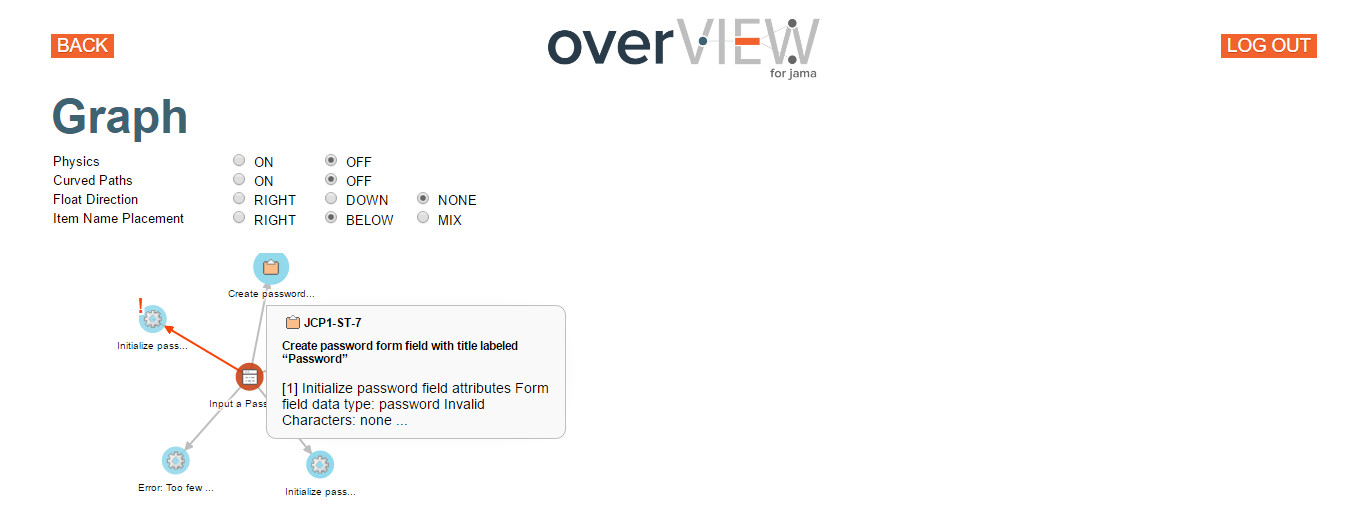
visualize the relationships between items that we pulled from the Jama Servers using their REST API. We
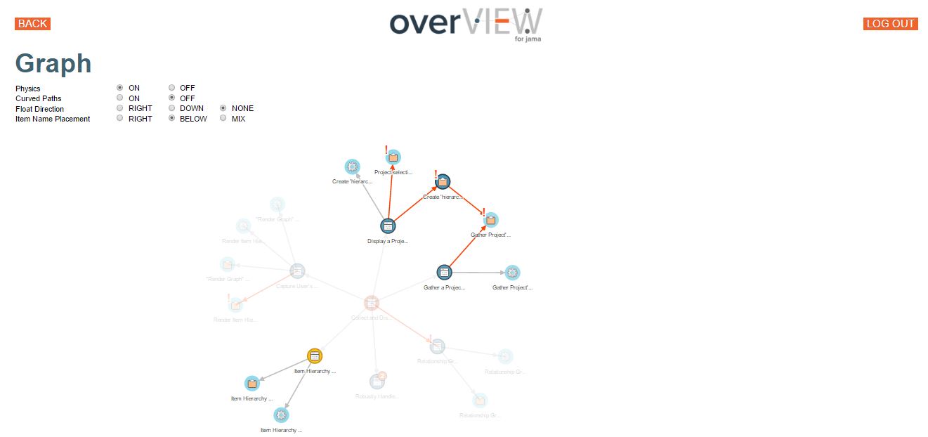
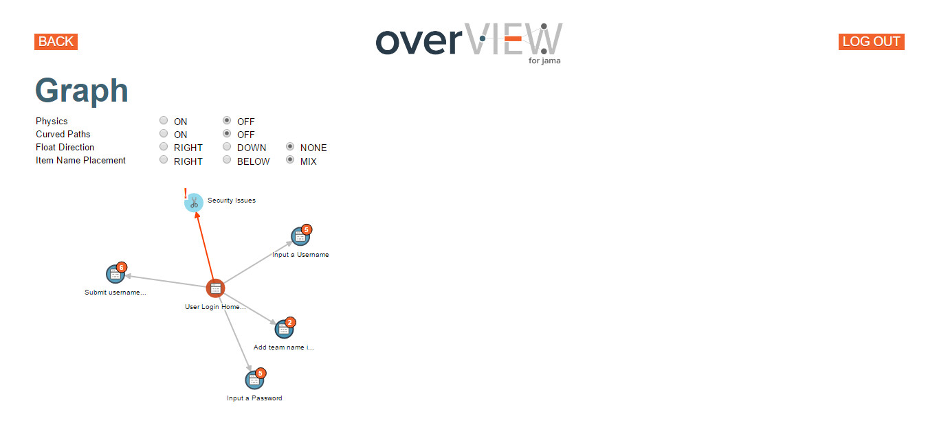
included the ability to highlight, collapse, and toggle node selections. Nodes and Edges have hover
tool-tips enabled. Any bugs/suspect issues would be flagged in orange. Collapsed nodes would have a
numerical indicator showing their downstream items.
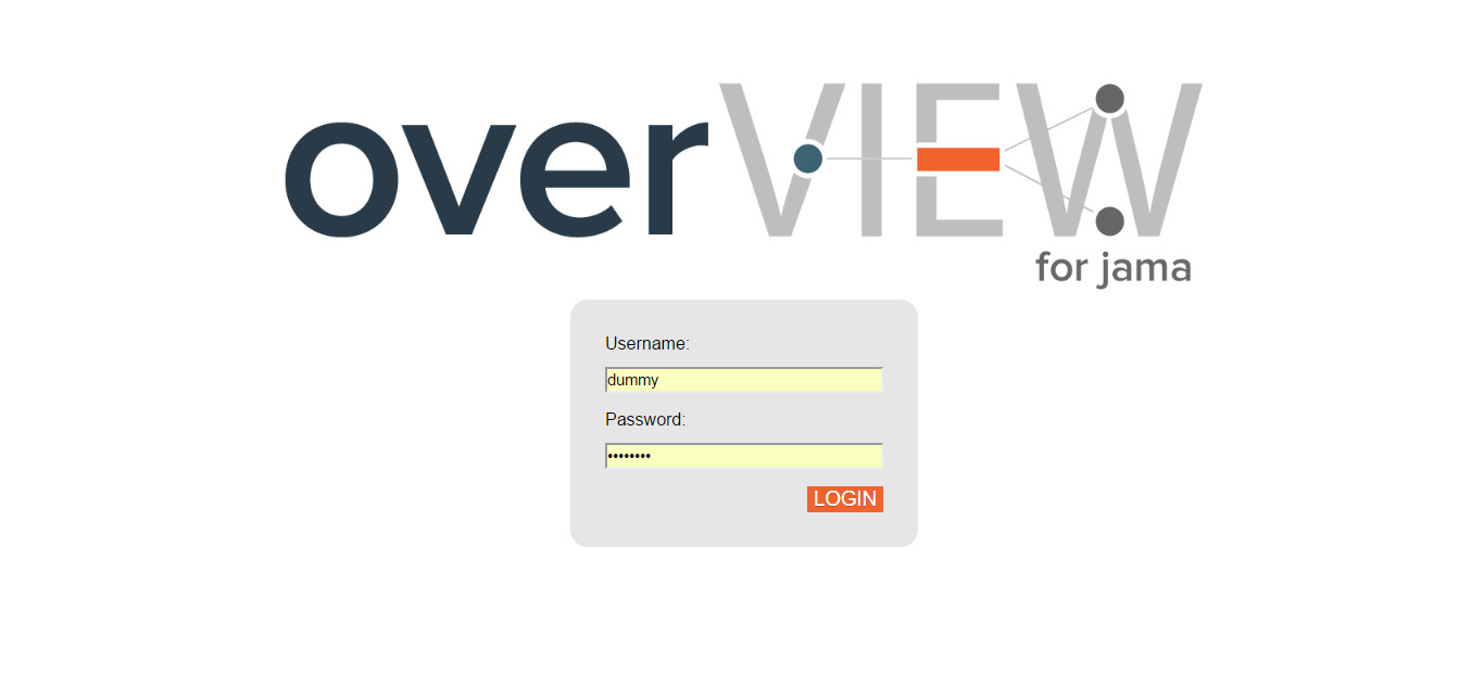
overView Login Page
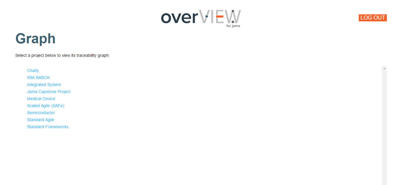
overView Project Selection
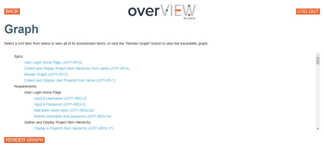
overView Root Item Selection

Simple overView Graph with Curved Edges
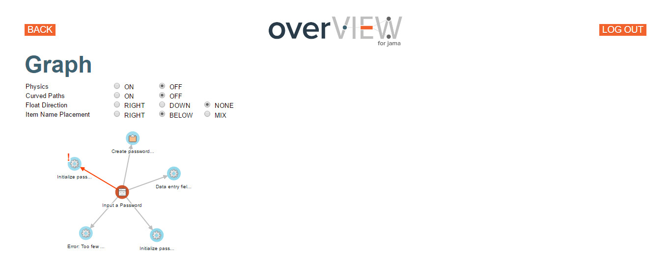
Simple overView Graph with Straight Edges
Complex overView Graph with Highlighted Segments
Complex overView Graph with Collapsed Nodes
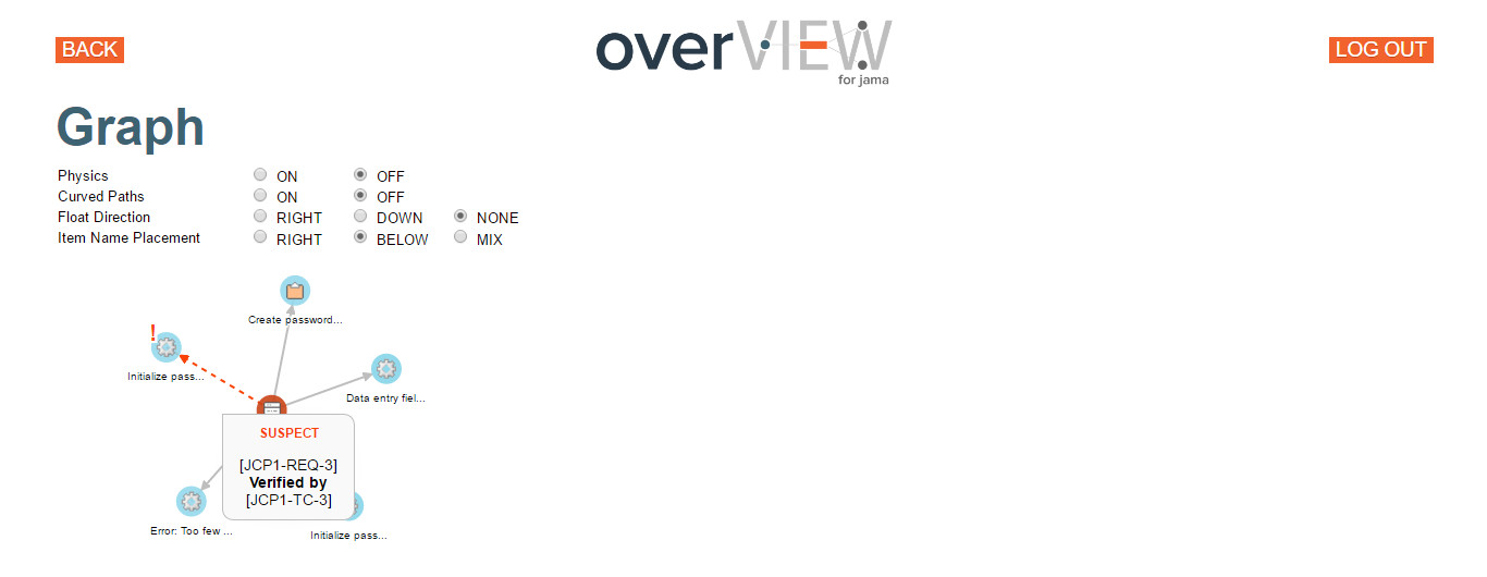
Simple Graph with Hovered Suspect Edge Tooltip